Tiny Tikes branding
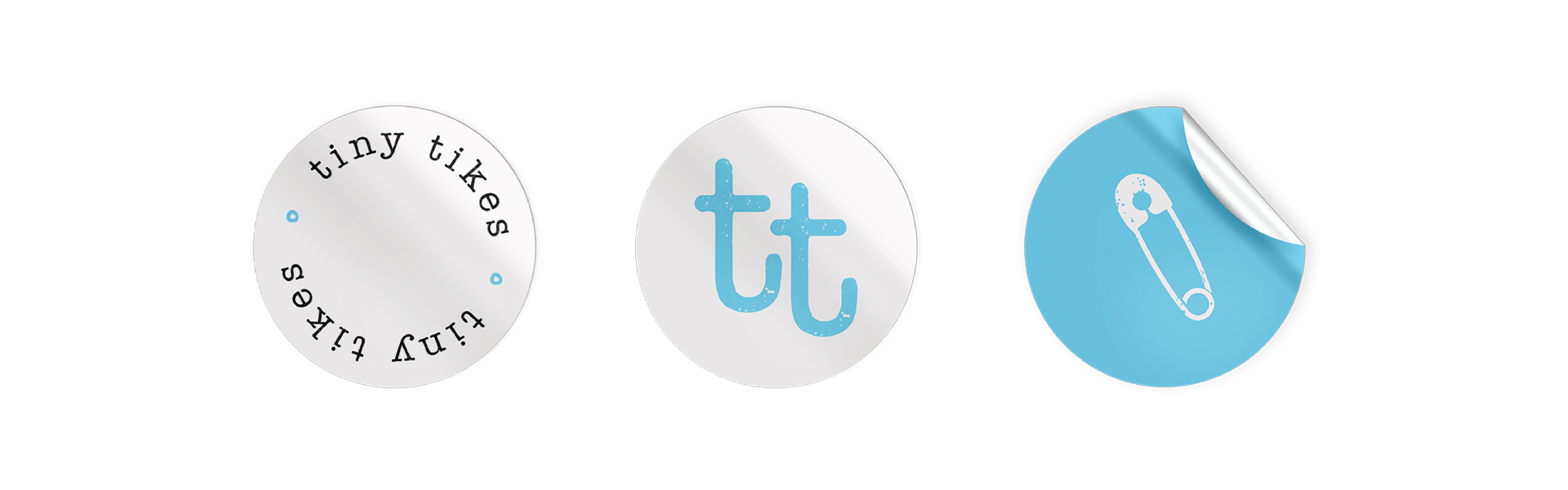
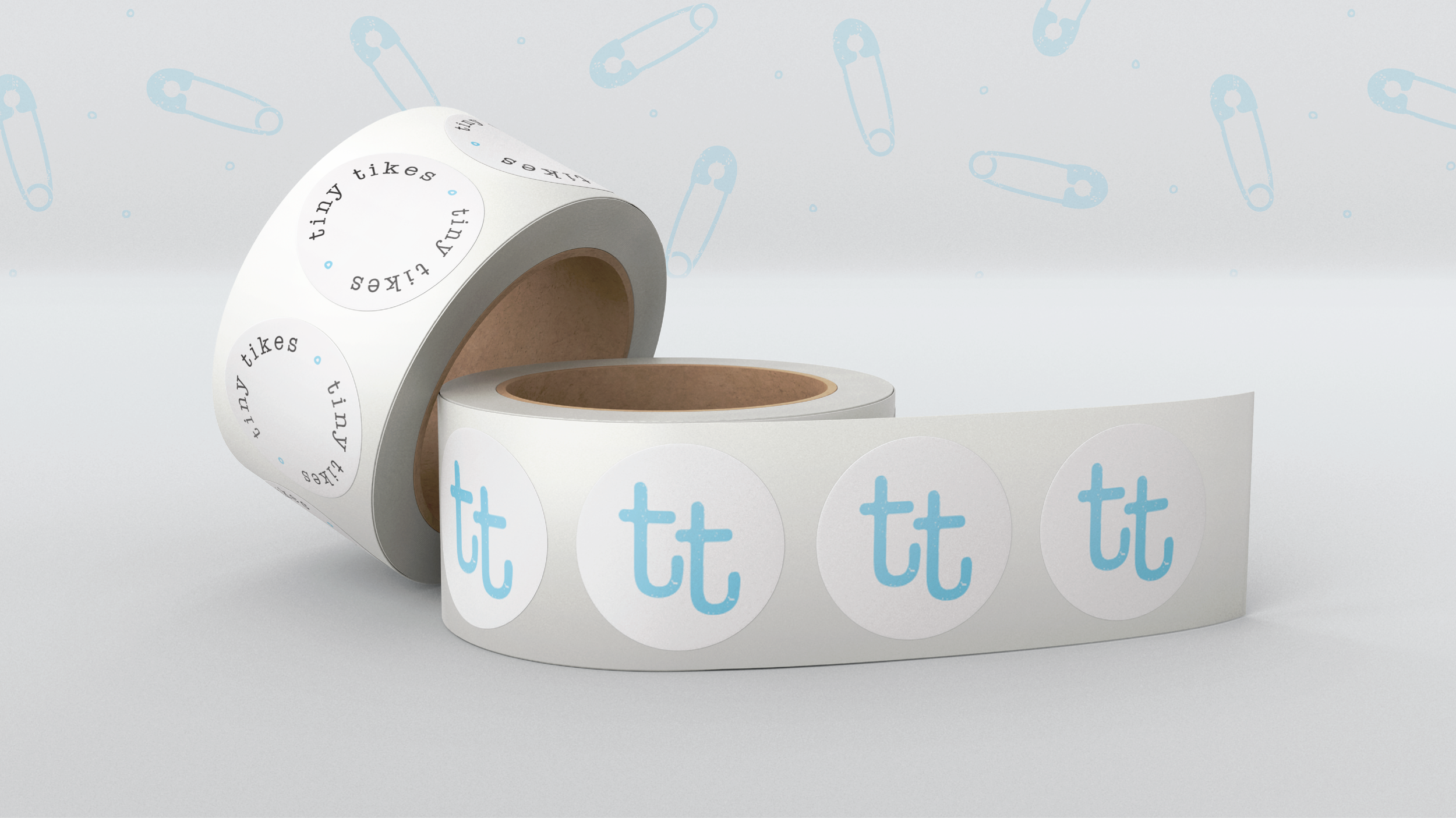
+ packaging
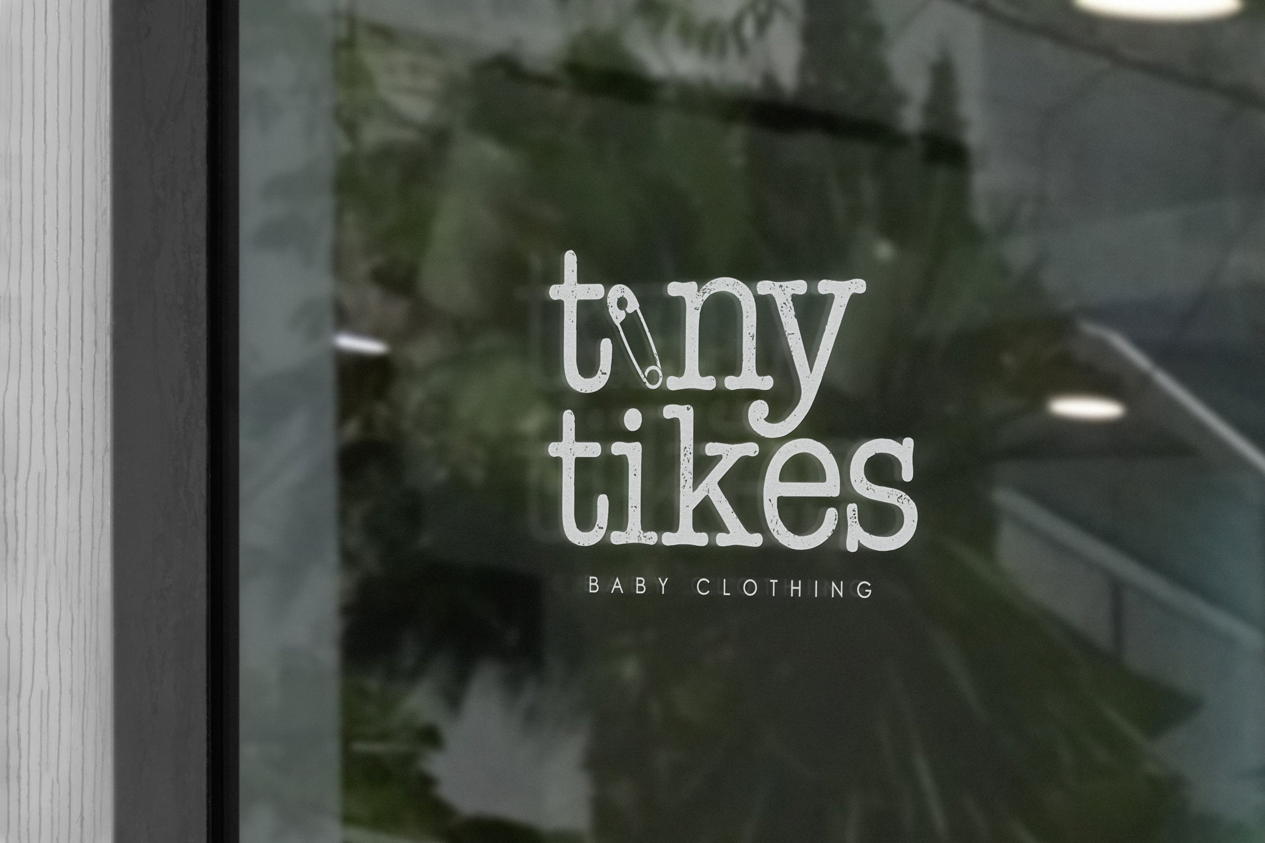
+ shopfront decals
+ branding
“Soft threads for small joys.”
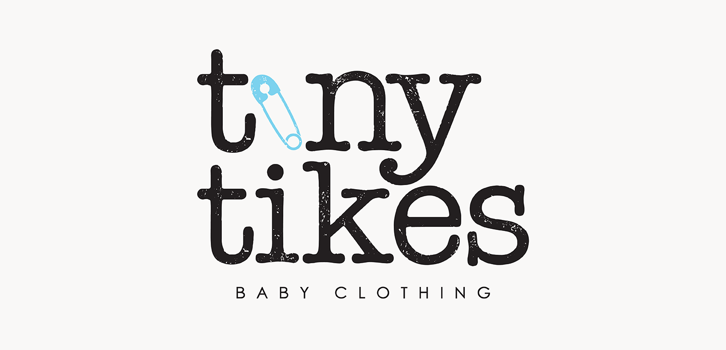
Tiny Tikes is a baby clothing brand designed to feel as soft and warm as the little ones it’s made for. The visual direction leans into a playful yet natural aesthetic - embracing the everyday magic of babyhood.
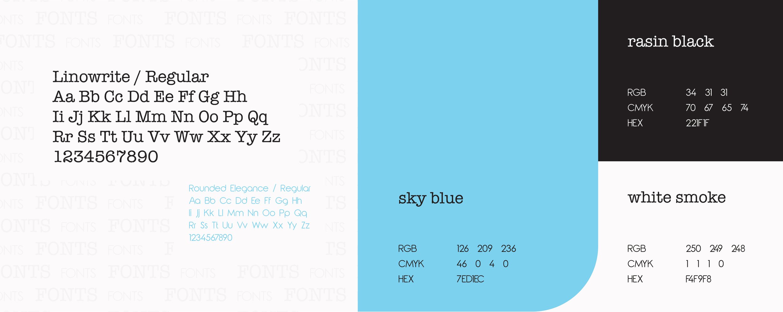
The brand identity combines clean, modern typography with a gentle quirk. The colour palette is intentionally soft and gender-neutral — baby blue for freshness and innocence, raisin black for depth, and white smoke for warmth. Together, they create a look that’s timeless, comforting, and easy to trust.
Every visual detail - from packaging to brand touch points - reflects Tiny Tikes’ values: gentle, thoughtful, and joyfully low-fuss. It doesn’t shout — speaks with a quiet confidence that feels like a warm hug and a little giggle all at once.
A brand made for wriggles, wonder, and wardrobe staples that just feel right.